|
|
The 311 Requests Dashboard is an ArcGIS Dashboard that allows the City of Columbus to seamlessly manage and analyze 311 requests from citizens. It is map-focused and uses "spatial binning" (grouping) to display large amounts of data in a readable way. NOTE: The data in this Dashboard is self-contained and is not affected by filters applied in the Condition Map or in any of the PowerBI dashboards.
1.You may be required to sign in to ArcGIS Enterprise in a pop-up window upon opening the 311 Requests Dashboard.
.png)
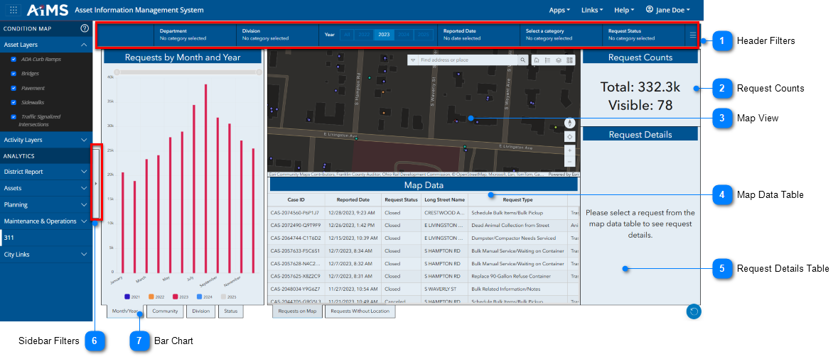
2.Once you log in, the Dashboard looks like this. NOTE: The visual components of the Dashboard are referred to as "widgets" (for example Requests by Month and Year, Map Data, Request Counts, and Request Details).
The table beneath the illustration explains the numbered callouts.
|

|
Header Filters
|
|
Click the right-arrow to see the header filters. Use these filters to filter data by: Department, Division, Year, Reported Data, Category, and Request Status. For details, click here: Header Filters.
|
|

|
Request Counts
|
|
View how many total features are included in the Map Data table that match all the conditions you set, as well as how many of those features are currently visible in the map. This changes if you apply more filters. For details, click here: Request Counts.
|
|

|
Map View
|
|
View 311 requests in the map. The requests are "binned" (grouped) for easier reading. Each hexagon is a bin; the number of requests appear within it. For details, click here: Map View.
|
|

|
Map Data Table
|
|
This table contains data records based on the tab you select:
•Requests on Map - data records for valid 311 requests. This data also appears on the map.
•Requests Without Location - data records with invalid location data.
|
|

|
Request Details Table
|
|
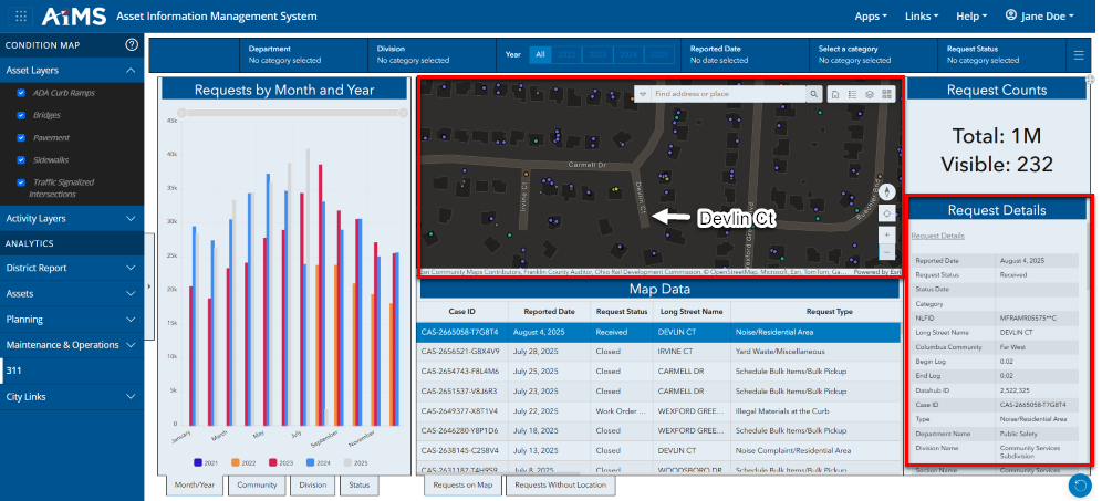
You must first select a record from the Map Data table to view its details in the Request Details table.
•The map view also changes to reflect the location of the selected record. Initially, the location looks like a bright magenta circle that pulses three times. You must zoom in to better see the location. In this example, you are looking at the details of the first record in the Map Data table (Devlin Ct)
•NOTE: The map view has the normal toolbar in the top-right corner that allows you to search, go to the Home extent, view the legend, turn layers on and off, and change the basemap. The bottom two buttons let you zoom in or out of the map. For more details, see Map Navigation.
|
|

|
Sidebar Filters
|
|
Click the right-arrow to display a vertical set of filters that allow you to filter by: Request Type(s), Street Name, Route ID (NLFID) and more. For details, click here: Sidebar Filters.
|
|

|
Bar Chart
|
|
View a visual representation of reported date. Click the right or left-arrows to display different types of bar charts: Requests by Month/Year, Community, Division, and status. For details, click here: Bar Chart.
|
|
|

