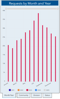
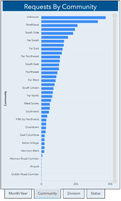
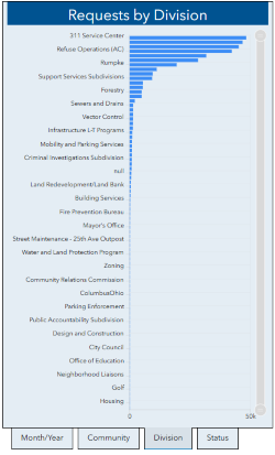
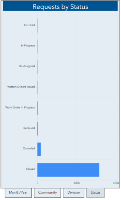
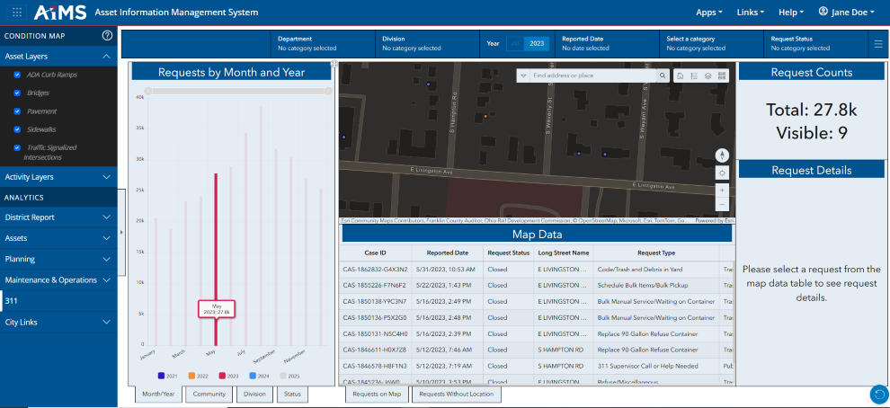
There are four dynamic bar charts in the 311 Requests Dashboard that provide additional visual analysis of 311 request data:
•Requests by Month and Year
•Requests by Community
•Requests by Division
•Requests by Status
These bar charts change dynamically as filters are applied in the Dashboard.
You can use any bar chart to filter the dashboard as follows:
1.Click one or more of the bars in the chart.
2.For example, clickthe bar corresponding to May 2023in the Requests by Month and Year chart to filter the entire dashboard to requests that were reported in May 2023. The Map Data table shows only records in May 2023.